#more playing with gradient maps and brushes lol
Explore tagged Tumblr posts
Text

god of death pre imprisonment mayhaps
#more playing with gradient maps and brushes lol#reuploaded bc I didn’t like the og crop#cult of the lamb#cotl#cotl narinder#narinder#cotl the one who waits#cotl toww#the one who waits#toww#fanart
80 notes
·
View notes
Text
My Favorite Cheap Art Trick: Gradient Maps and Blending Modes
i get questions on occasion regarding my coloring process, so i thought i would do a bit of a write up on my "secret technique." i don't think it really is that much of a secret, but i hope it can be helpful to someone. to that end:

this is one of my favorite tags ive ever gotten on my art. i think of it often. the pieces in question are all monochrome - sort of.
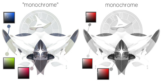
the left version is the final version, the right version is technically the original. in the final version, to me, the blues are pretty stark, while the greens and magentas are less so. there is some color theory thing going on here that i dont have a good cerebral understanding of and i wont pretend otherwise. i think i watched a youtube video on it once but it went in one ear and out the other. i just pick whatever colors look nicest based on whatever vibe im going for.

this one is more subtle, i think. can you tell the difference? there's nothing wrong with 100% greyscale art, but i like the depth that adding just a hint of color can bring.
i'll note that the examples i'll be using in this post all began as purely greyscale, but this is a process i use for just about every piece of art i make, including the full color ones. i'll use the recent mithrun art i made to demonstrate. additionally, i use clip studio paint, but the general concept should be transferable to other art programs.

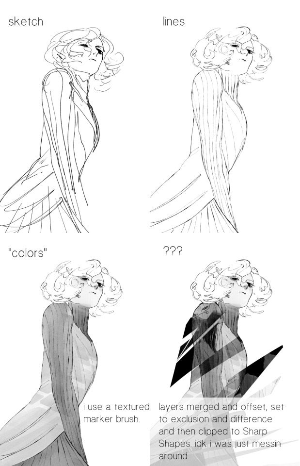
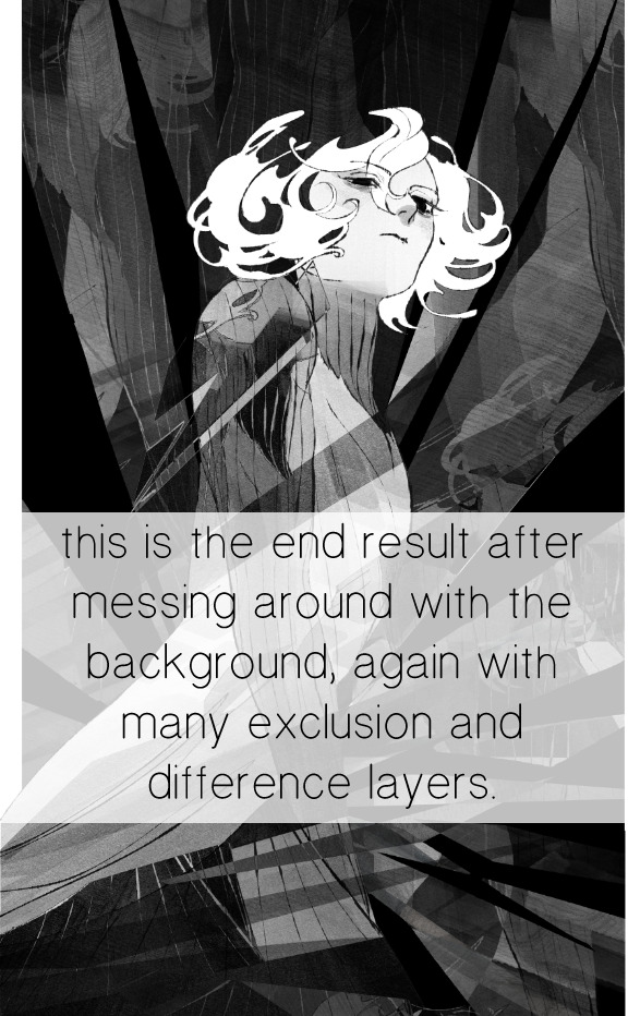
for fun let's just start with Making The Picture. i've been thinking of making this writeup for a while and had it in mind while drawing this piece. beyond that, i didn't really have much of a plan for this outside of "mithrun looks down and hair goes woosh." i also really like all of the vertical lines in the canary uniform so i wanted to include those too but like. gone a little hog wild. that is the extent of my "concept." i do not remember why i had the thought of integrating a shattered mirror type of theme. i think i wanted to distract a bit from the awkward pose and cover it up some LOL but anyway. this lack of planning or thought will come into play later.
note 1: the textured marker brush i specifically use is the "bordered light marker" from daub. it is one of my favorite brushes in the history of forever and the daub mega brush pack is one of the best purchases ive ever made. highly recommend!!!
note 2: "what do you mean by exclusion and difference?" they are layer blending modes and not important to the overall lesson of this post but for transparency i wanted to say how i got these "effects." anyway!
with the background figured out, this is the point at which i generally merge all of my layers, duplicate said merged layer, and Then i begin experimenting with gradient maps. what are gradient maps?
the basic gist is that gradient maps replace the colors of an image based on their value.

so, with this particular gradient map, black will be replaced with that orangey red tone, white will be replaced with the seafoamy green tone, etc. this particular gradient map i'm using as an example is very bright and saturated, but the colors can be literally anything.
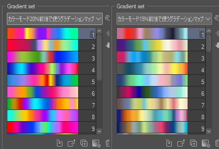
these two sets are the ones i use most. they can be downloaded for free here and here if you have csp. there are many gradient map sets out there. and you can make your own!
you can apply a gradient map directly onto a specific layer in csp by going to edit>tonal correction>gradient map. to apply one indirectly, you can use a correction layer through layer>new correction layer>gradient map. honestly, correction layers are probably the better way to go, because you can adjust your gradient map whenever you want after creating the layer, whereas if you directly apply a gradient map to a layer thats like. it. it's done. if you want to make changes to the applied gradient map, you have to undo it and then reapply it. i don't use correction layers because i am old and stuck in my ways, but it's good to know what your options are.

this is what a correction layer looks like. it sits on top and applies the gradient map to the layers underneath it, so you can also change the layers beneath however and whenever you want. you can adjust the gradient map by double clicking the layer. there are also correction layers for tone curves, brightness/contrast, etc. many such useful things in this program.
let's see how mithrun looks when we apply that first gradient map we looked at.

gadzooks. apologies for eyestrain. we have turned mithrun into a neon hellscape, which might work for some pieces, but not this one. we can fix that by changing the layer blending mode, aka this laundry list of words:

some of them are self explanatory, like darken and lighten, while some of them i genuinely don't understand how they are meant to work and couldn't explain them to you, even if i do use them. i'm sure someone out there has written out an explanation for each and every one of them, but i've learned primarily by clicking on them to see what they do.
for the topic of this post, the blending mode of interest is soft light. so let's take hotline miamithrun and change the layer blending mode to soft light.

here it is at 100% opacity. this is the point at which i'd like to explain why i like using textured brushes so much - it makes it very easy to get subtle color variation when i use this Secret Technique. look at the striation in the upper right background! so tasty. however, to me, these colors are still a bit "much." so let's lower the opacity.
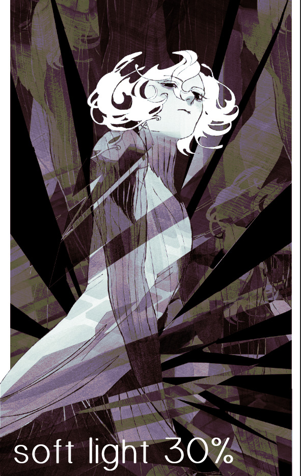
i think thats a lot nicer to look at, personally, but i dont really like these colors together. how about we try some other ones?
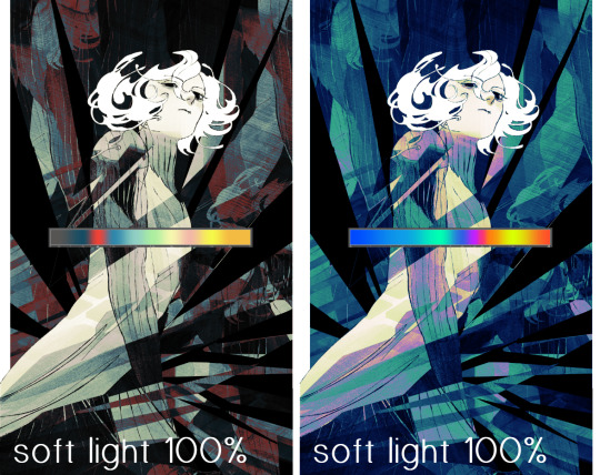
i like both of these a lot more. the palettes give the piece different vibes, at which point i have to ask myself: What Are The Vibes, Actually? well, to be honest i didn't really have a great answer because again, i didn't plan this out very much at all. however. i knew in my heart that there was too much color contrast going on and it was detracting from the two other contrasts in here: the light and dark values and the sharp and soft shapes. i wanted mithrun's head to be the main focal point. for a different illustration, colors like this might work great, but this is not that hypothetical illustration, so let's bring the opacity down again.
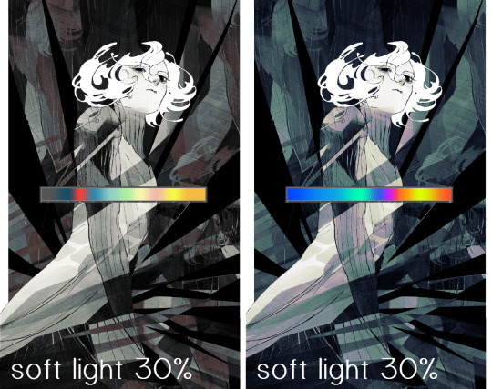
yippee!! that's getting closer to what my heart wants. for fun, let's see what this looks like if we change the blending mode to color.
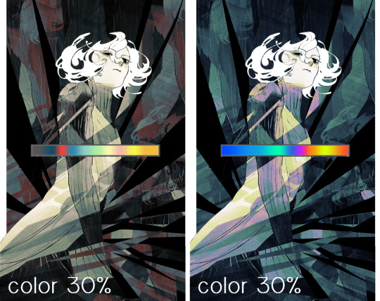
i do like how these look but in the end they do not align with my heart. oh well. fun to experiment with though! good to keep in mind for a different piece, maybe! i often change blending modes just to see what happens, and sometimes it works, sometimes it doesn't. i very much cannot stress enough that much of my artistic process is clicking buttons i only sort of understand. for fun.
i ended up choosing the gradient map on the right because i liked that it was close to the actual canary uniform colors (sorta). it's at an even lower opacity though because there was Still too much color for my dear heart.
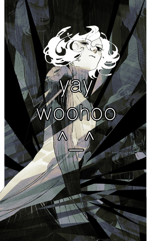
the actual process for this looks like me setting my merged layer to soft light at around 20% opacity and then clicking every single gradient map in my collection and seeing which one Works. sometimes i will do this multiple times and have multiple soft light and/or color layers combined.
typically at this point i merge everything again and do minor contrast adjustments using tone curves, which is another tool i find very fun to play around with. then for this piece in particular i did some finishing touches and decided that the white border was distracting so i cropped it. and then it's done!!! yay!!!!!
this process is a very simple and "fast" way to add more depth and visual interest to a piece without being overbearing. well, it's fast if you aren't indecisive like me, or if you are better at planning.

let's do another comparison. personally i feel that the hint of color on the left version makes mithrun look just a bit more unwell (this is a positive thing) and it makes the contrast on his arm a lot more pleasing to look at. someone who understands color theory better than i do might have more to say on the specifics, but that's honestly all i got.
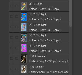
just dont look at my layers too hard. ok?
2K notes
·
View notes
Note
im curious, how do you color your lines? they always look so pretty!!!
Thank you! I pretty much just use a bunch of layers lol I start with something like this in just one color (I used a soft round brush on like 70% opacity for lining this)

Then on a new layer in multiply I go over all the parts I want to stand out more in a different + darker color. I also make a clipping layer to lighten certain parts of the lines from the first step. Explaining which lines I color is difficult to describe but I'm mainly thinking about defining the edges of distinct objects and the light source
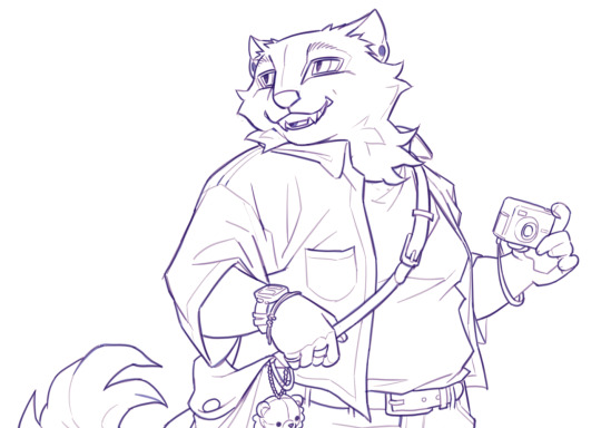
You can stop there but I like to add some kind of color filter top of that. My favorite way is make a solid color layer on exclusion mode above the lines > merge all visible layers on a new layer > set this to "color" layer mode so it colors all the lines underneath, but there's a lot of ways you can do similar stuff. I think a gradient map would probably be easier and give you more control for a similar effect
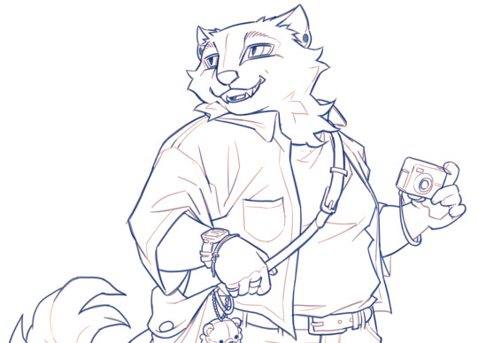
Then I add flats on a multiply layer above all that. TLDR I like to have variation in value of the lines and then vary the hue depending on the value. I don't have a method for how I pick the filters or line colors really I just play around with what I think looks nice with the colors of the piece 🫶

#my process basically involves redrawing over the same thing a billion times so if that's not what you're into this is probably not#the method for you LOL#ask#anonymous#long post
232 notes
·
View notes
Text

(Click the image for better quality)
Yipeeee that Keiki and Mayumi fanart I posted the WIP of is finally done woooo- This piece was a very experimental one that I'm kind of OK on. Maybe because I've just gone insane looking at it for so long and I'm my own worst critic lol.
Artist's Notes;
So I've once again been playing around with my rendering style, mainly because I have been wanting to improve my lighting for a while now and as I was just scrolling through Tumblr, I saw some of the official art for that one webcomic-turned-animated-TV-Show Lackadaisy and was immediately inspired. I also have seen a technique a few times in the past where the lineart and shading are merged together, so I've been meaning to try that for a little while.

I did some experimentation on this one sketch of Keiki I posted in my sketch dump and I really liked the results of it, so I carried those over to this piece.
I ended up scaling up Keiki and Mayumi from the original WIP because I felt like they were both getting lost in the composition, and I'm glad for that because I think it works a lot better. I'm not a fan of how Mayumi's sword turned out at all, but it's not really meant to be the focus of the piece so eh. Overall, I think I could do better with my colours, probably because with Keiki and Mayumi's colours, I did them flat in greyscale and then used a brush on the overlay blend mode to colour all of them over, after which I changed the base layer for their colours from white to yellow and then lowered the opacity so it all went together better. I also decided to use gradient maps for a lot of the background elements, mainly to experiment with getting in my values first to make them pop out more. I ended up finding a really nice sky gradient on Clip Studio Paint that I really liked, and that kinda helped to establish the colour scheme of the background a lot. I think the whole "start in greyscale then colour" thing really works better with painterly styles rather than more illustrative ones, and while it is good at making sure your values are more readable, I honestly don't think I have the skill level to pull that off yet. Honestly, I think I've been looking at this drawing too long or maybe I added too much to it, but I wish I could've made the colours less monochromatic, but I'll just save that for the next piece I do.
I do love how the flame (...well it's more of a weird space rift than anything in this piece) and the lighting turned out, those were fun to do. I was initially struggling with the flame and how Mayumi is positioned in front of it before realizing "Oh wait! This is a weird abstraction of a weird creature! I don't have to follow the laws of anatomy!" and just dislocated it's flamey bottom jaw from the main body. I also changed the colours of it since I was really not liking how incredibly bright it was when it had lighter colours. Again, the gradient maps served the more painterly style of the flames well.
I also love how Mayumi turned out. I could do her sleeves better but that's more of just me needing to study how those types of sleeves fold in that position more. I'm also very happy with the posing, the technique I used for that was taking photos of myself in the positions I wanted, blocking in the silhouette and then modifying that by adjusting it to my lines of action that I drew on top of the original photos, and then sketching over the silhouettes and drawing in the shapes of the hands overtop of the photo if I needed to get the fine details right. As for what I do to take the pictures myself, I use a tall chair I have, prop up my phone with a phone stand, put on a ten second timer and scramble to get in position. Yes, I did have to use a bunch of thin markers I had to try and get the hand positioning on Keiki's pose right, yes I do have a fake sword that I used to get the positioning of Mayumi's arms and hand right, the sword was for an old Halloween costume from several years ago. I really like how both Keiki and Mayumi turned out in this drawing, I'll have to play around with these designs for them more in future drawings.
Also, if you wanna know why I draw buildings like that, when I watched Fantasia 2000 as a kid (One of the Disney movies where they make really beautiful animations to classical music) the way they drew the buildings in the first few sections Rhapsody in Blue segment (the jazz one with the cities) changed my brain chemistry and now whenever I need to draw buildings really quickly, I refer back to that. Since the buildings aren't really the main subject, I didn't put much thought into them.
As you can tell I am very tired of this piece, mainly because I made things harder for myself by overcomplicating the process compared to what I usually do, mainly with the whole "starting in grayscale then adding colour." I'd honestly just prefer having a black layer set to colour that I can just toggle on and off when I need to see the values, but it was good to experiment. And that was mainly the point of this whole drawing, to experiment. I'm definitely going to have to play around with this new style I'm going for, mainly because I liked how it turned out a lot in the augmented Keiki sketch, and also because I want to find ways of making it suit my style more. I also really want to keep experimenting with my lighting like this, it's very fun. Last but not least I am never starting in greyscale again because dear god I do not like the workflow it forced me into. I don't have a problem with the method itself it's mainly just a skill issue lol.
If you wanna read my headcanons for these two, I put them in my WIP post, so you can read them there if you want to. The more I look at this the more I prefer the simplicity of my WIP. I might go back to this and just take away the fancy colours and effects to see what it looks like without all of that stuff and reblog this post with that drawing, but for now, I don't think I can look at this drawing again for a while.
#touhou project#art#fanart#touhou fanart#touhou 17#wily beast and weakest creature#keiki haniyasushin#mayumi joutougu#haniyasushin keiki
116 notes
·
View notes
Text
Astarion x Tav OC

Cat and dog energy. These lovebirds roam in my daydreams! Insight about this drawing in the Read More.
Draft - Sketch & Lining - Coloring


The draft was revamped a few times, especially with my Tav’s body angle. I forced myself to be quick with it as my goal for this drawing was something “quick” and simple…ish. Since it was only headshots, I was curious to see what I would prioritize considering I lifted off most stress from full body anatomy.
Sketch and lining are together because I basically did my final sketch then sculpted in the lines, meaning I cleaned and erased the edges to my liking. You can tell Astarion got a HUGE improvement! Liquify tool is a life saver! I allowed myself to be a bit messy, or at least forgiving about line quirks. Technically, I didn’t line the pupils and hair, as I’ve learned to work off its silhouette. I block in the shape, Alpha Lock, then render/color. It’s an awkward in between but for the sake of nice images, I adjusted them to fit the line art, otherwise I’d have to leave them bald.
Coloring, I work through sections, so here I jump around a lot! I had a lot of fun figuring out how to mimic traditional art, and kept swooning at how cute this was LOL. I had a lot of fun with my new brushes and the setup inspired me to keep working. Although, that could also be the 8 hour sessions of BG3 talking. Astarion was very scary to color, so you can imagine how HAPPY I was to have pulled this off! He took the most time. Goes to show just how comfortable I was with this style of drawing that I didn’t feel super drained!
Finalizing


I was going to call it done at that first one, but decided I could do more. Here is where I just messed around with different ideas, adding layers and color adjustments. In this case, I wanted something to compliment the traditional feel and really send the message across. I did a white border just as I would’ve years ago, when I did traditional art. It felt right to write in my signature instead as well. I used to love using gel pens. The final image has a little gradient map color filter, just to tie the colors together. I like giving my drawings a nice dreamy warmth to them.
Conclusion
I need to draw these two more. Astarion is a painful muse. Bury me with this drawing. I should do a proper character study on my Tav. He’s a sweet little redeemed Durge, I like to think of him as Astarion’s bloody droplet. Also I need to actually play Durge.
I’m so happy with this drawing. ;)
#character illustration#digital art#male character#rendered#clip studio paint#artwork#drawing#original character#illustration#bg3 art#bg3 fanart#bg3 tav#bg3 astarion#bg3 durge#bg3 oc#baldurs gate tav#baldurs gate 3#baldurs gate astarion#baldur's gate oc#digitalart#digital aritst#dbh fanart#artists on tumblr#small artist#my art
24 notes
·
View notes
Text
Krita tutorial the way I know it.
Basics: What is where.
Gimmicks.
Specific advice on specific tools.
Basics: What is where.

Upon opening the program this is what you're met with. First of all, must comment: The layout is HEAVILY editable so you can just drag menus anywhere you want, even leave them floating amidst the sheet you're drawing on.
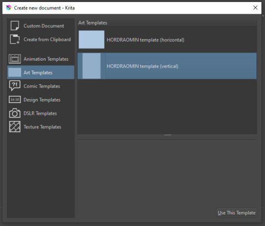
You can create custom art templates, I have two o'mine here as both have my signature background color.
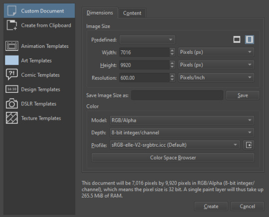
As well, you can edit the custom document settings, as in what size you want it, what resolution, even the initial content of the image. As well you can create from clipboard: Just copy some image from your browser and Krita will recognize it (useful for making meme edits lol).

Now, once you have your file, I will show you what is where.
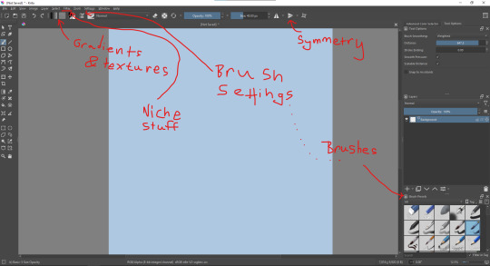
Brushes:
Brushes are easy to edit and there are tons of free bundles to download online. I myself only got one bundle, Jackpack (bit hard to find now due to original source being lost, it is still available but bit tricky to come by).
There. Are. Tons.

Some of these are my custom brushes for calligraphy in neography, you might even guess which ones. You can edit existing brushes, make new ones from the ones you've edited without changing the original, and all sorts of stuff (more below in the third chapter).
There are numerous packages of brushes once you enter Krita, but only one/two are available when you first open it. To unlock them all, click here:
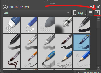
And make sure all bundles are dark gray in color (example of both dark and light below).
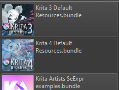
Now Tools Options: those will pop up depending on what tool you're using.
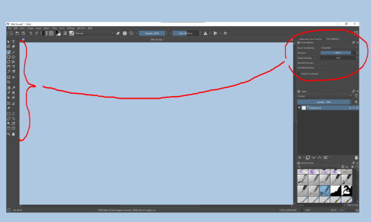
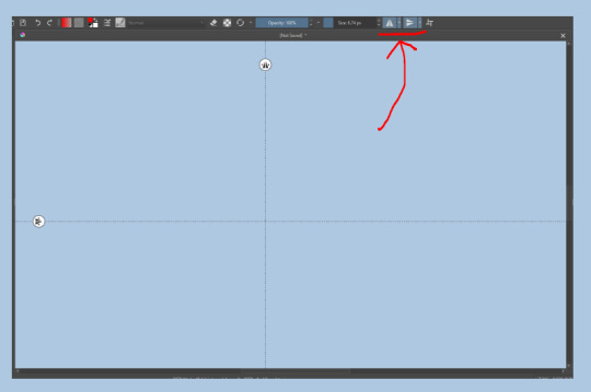
Symmetry: Fun stuff. You can drag the lines depending on how you need them and then center them back to the center of the screen if needed.
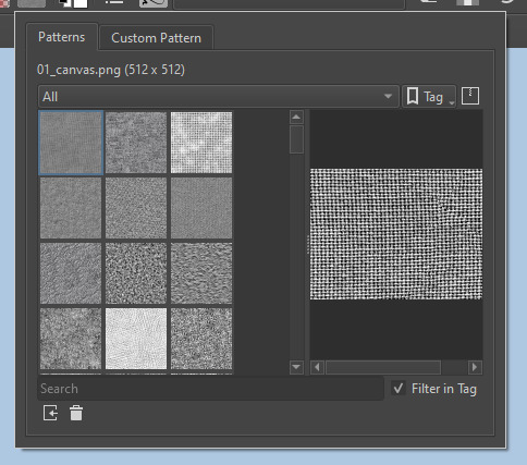
Gradients and Textures also have their tools options, you can play with those to get the feeling what they can do (more in third chapter).

The Filters tab is useful too. Blurring, motion blurring, color mapping, artistic filters and all that: Quite fun.
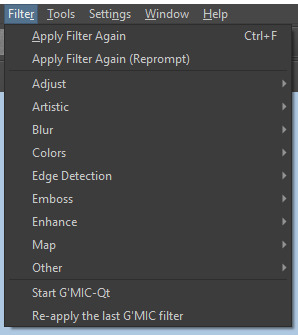
Gimmicks.
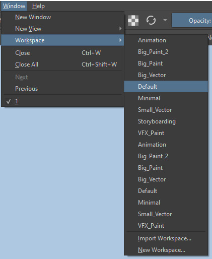
Krita allows you to customize your workspace freely. Floating menus, tabs, anything you want. It has quite many drivers at that-
To access the workspace templates, go to Window and choose Workspace.
Krita allows for copy-pasting any image onto the sheet. Though, for me it sometimes crashes if I accidentally copy-paste text into it without choosing the Text tool first.
The software allows for both raster and vector work. It is basically Photoshop sharpened to be used by artists primarily.
There are some interesting mechanics regarding the Eraser (default bind E).

You can use it with any brush, allowing for textured erasure/quick work. Good for sketching.
You can use it on gradients (given there's a transparent point on the gradient preset).
There's a Multibrush tool:

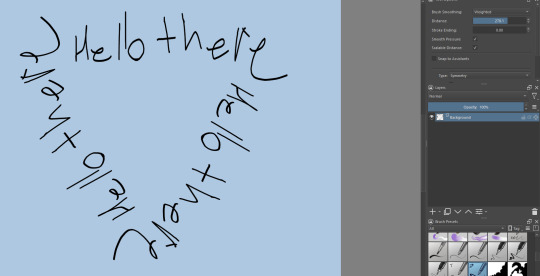
People say Krita is good for animation but my brain can't wrap around it yet honestly @~@.
The keybinds:
B - Brush tool.
E - Erase tool option.
M - Mirror (useful for checking accuracy from a new angle).
Ctrl - Color pick (when used with brush or other color-using tools).
Shift+L.Mouse+drag - Changes the size of the brush by dragging left and right.
Ctrl+E - Merge layer with the one below.
Ctrl+G - Group selected layers.
Ctrl+A - Select whole sheet.
Ctrl+Shift+A - Deselect everything.
F - Bucket tool.
G - Gradient tool.
Ctrl+S - Save document.
Ctrl+Shift+S - Save As document.
Ctrl+N - New document.
Ctrl+O - Open document (will be seen in a new tab on top of the sheet).
Ctrl+C - Copy selected layer or selection.
Ctrl+X - Cut selected layer or selection.
Ctrl+V - Paste copied/cut layer or selection.
Q - Multibrush tool.
R.Mouse - Interesting thing: Opens up a quick selector for brushes and colors you've already used in the piece.
1 - Zoom 100%.
2 - Zoom to fit the piece vertically.
3 - Zoom to fit the piece horizontally.
4, 5, 6 - Turn 15 degrees (4 and 6) or undo the turning whatsoever (5).
Ctrl+I - Negative filter applied to layer.
Ctrl+U - Color editing on the layer.
Ctrl+Y - Soft proofing mode (for color mistakes and stuff like that, mostly annoying for me tbh).
Ctrl+T - Transform selection/layer.
Ctrl+R - Square select tool.
Ctrl+J - Lasso select tool.
Honestly you can just hover your mouse over tools and see their shortcut binds, as well. Or edit them in Settings.
Specific advice on specific tools.
Brush:
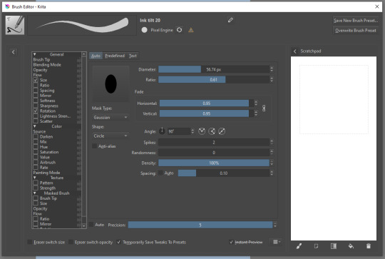
Brush editor is a great tool for making custom brushes, and it even has a sratchpad to test them out. Lots of settings, but no need to be afraid; Most of them you might never use on purpose.
Use Brush Smoothing for great and pretty lines in lining pieces or making calligraphy.
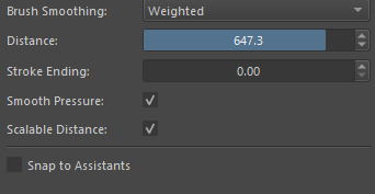
Gradient:
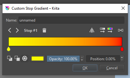
The four icons to the right top are:
Mirror gradient.
Arrange by lightness value.
Arrange by color value.
Space the stops evenly.
Click the gradient to add a new stop. The three things to the left are:
Make the stop use Primary Color.
Make the stop use Secondary Color.
Make the stop use a fixed color.
297 notes
·
View notes
Note
Hi, I love your blog and your edits. I was wondering if you could do a tutorial on how you combine multiple gifs into one in the first gif of yours MIKELOGAN’s 5K FOLLOWER CELEBRATION || GET TO KNOW ME MEMEFAVORITE ACTORS [2/10]Colin Firth (September 10, 1960) set? Thank you for reading this and helping me.
thank you so much, that's so kind!! this is the post in question (which was inspired by this gorgeous set) and i'll break down how to do it step by step below the cut!
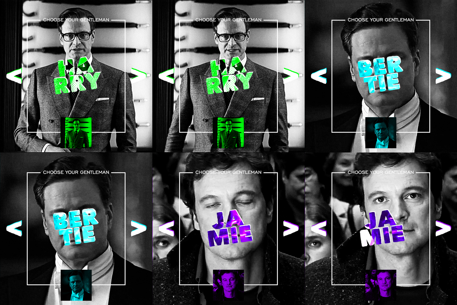
i ended up saving this gif as a psd because i remember it taking me so long and being really frustrating, i just wasn't sure why. for reference, i posted that set back in september, just over four months ago. looking at the psd, i can see just how far i've grown as a gifmaker bc that thing is a hot mess. i made it about 3x more complicated than it needed to be, so let's do this the right way lol note: i was still using 0.07 frame rate at this point. i have since switched to 0.05 for smoother, quicker gifs.
what we're going to do is create all of these gifs separately and put them together at the end. in total, there are 6 individual gifs. let's start with harry.
i gif by importing video frames to layers, but if you prefer to screencap, load those in instead. because this ends up being a pretty large gif, both in size and length, i kept it to 20 frames per clip.
once you're satisfied with the frames you've chosen, crop your canvas to 540px x 540px. this is what i'm left with
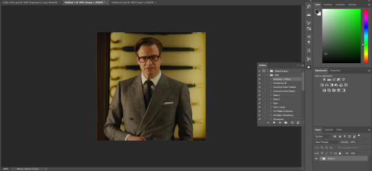

this is when i sharpen my gifs. everyone's process is a little different. i created my own sharpening action, which converts my frames to video timeline and then sharpens.
the next step is to color your gif. if you're going for the overall look in mine, here were my layers:
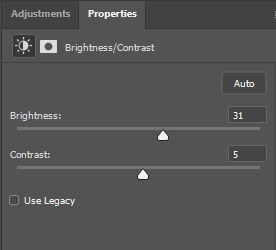
a brightness/contrast layer with brightness set to 31 and contrast to 5. this will depend on the scene you're working with

a levels layer using the black and white eyedroppers. the top one is your black eyedropper. to use it, click it and select the blackest part of your gif. do the same with the white eyedropper and select the lightest part of your gif. you may need to play around with selecting different points depending on your scene and the original coloring
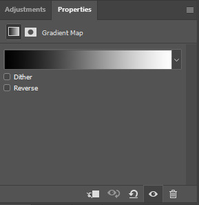
finally, a simple black & white gradient map layer on top
now we're going to add the thin rectangular border in the middle of the gif. i use the rectangle shape tool for this (press U on your keyboard) and these are my settings (x and y coordinates don't matter):

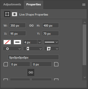
to center it perfectly, i use ctrl+T and drag it until it snaps into place with both the vertical and horizontal guides.
next, let's add the "choose your gentleman" text that goes at the top of the border. here is the font i chose and its settings:

once again, press ctrl+t and drag this to the vertical center of your gif and to the center of the top of the border. you should feel and see it snap into place. this is what we have now:
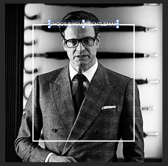
now, we're going to use a layer mask on the border so we can read the text. select the rectangle layer and click the layer mask button
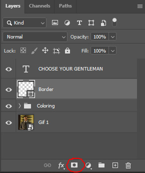
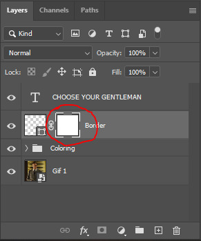
with the layer mask selected (as shown in the second image), use the rectangular marquee tool (M on your keyboard) to draw a rectangle around your text, taking care to keep it just a little larger
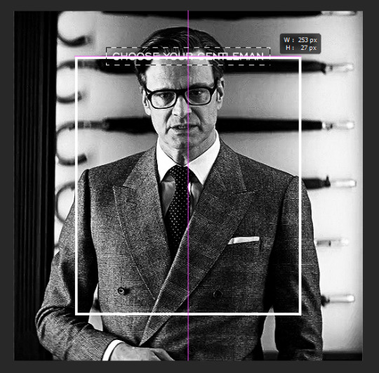
as you can see, you'll know when you're perfectly centered through your text layer and vertically on the entire canvas. select your brush tool without deselecting this rectangle (B on your keyboard) and paint the selection with a black brush. this masks that part of the border!


let's add the small square gif that goes at the bottom of the border now. i think the easiest way of doing this is to use the rectangular shape tool (U) again. the size of this gif is 110x110, so create a black square of that size with no stroke. Use ctrl+T to drag it to the center of the bottom of the border (the x and y coordinates don't matter):
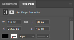
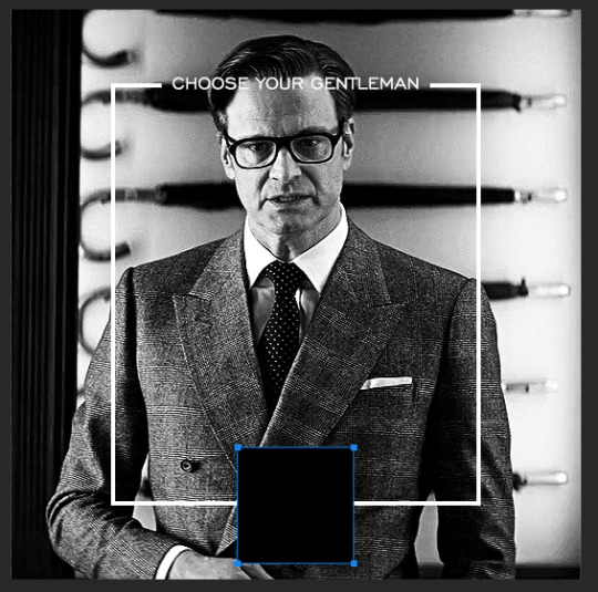
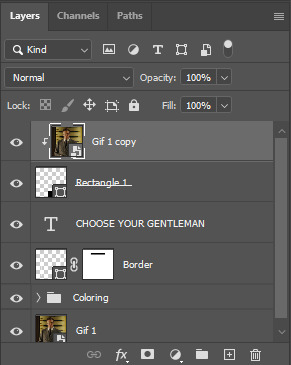
now duplicate your original gif layer (ctrl+J) and drag it to the top of the layer panel. right click on it and create clipping mask. this will make it so the gif only appears within the confines of the square we just created. resize your gif by using ctrl+T and, making sure the proportions are locked, drag the corners to the edges of the square.
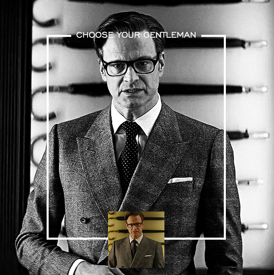
this gif is not colored at all as we only duplicated the gif itself and not the coloring layers. i duplicated those as well and dragged them on top of our small gif, but it's important to make sure those are using the clipping mask as well. you can click this on the properties layer of each adjustment layer to make sure they do.
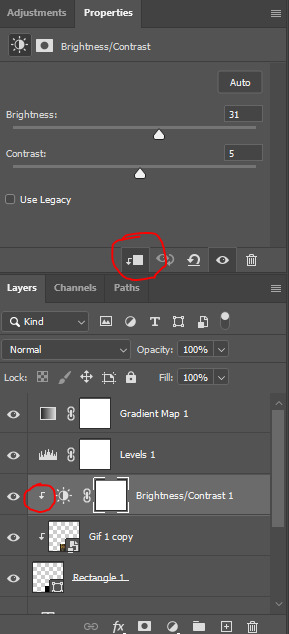
you'll know you've been successful when you see the small arrow next to each of your coloring layers. this keeps them from affecting the coloring of the larger, main gif.
we're going to change the gradient map adjustment layer from black & white to black & lime green (or the color of your choosing). click on that layer and then on the map. this will bring up the gradient editor. click on the small white color stop at the far right end of the gradient and then on the color picker, choose a new color.

the hex code i used for the lime green is #00ff0c
our last steps are the angle brackets on either side of the gif and harry's name in the center. here are the settings i used for those (angle brackets on the left and harry on the right):
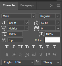
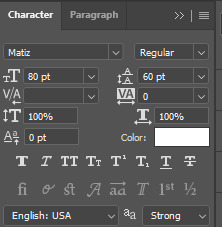
the layer styles for harry's name (double click on the text layer to call up this menu OR right click > blending options):
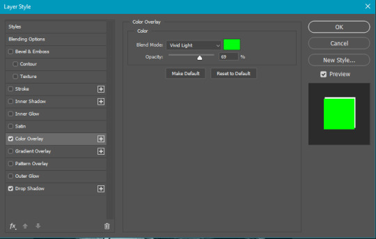
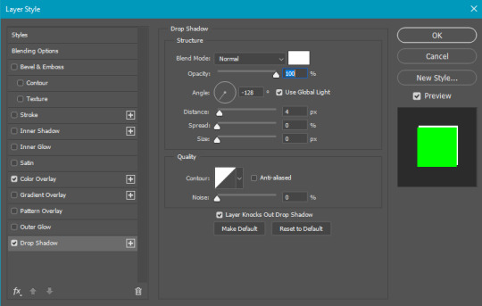
and for the angle brackets:
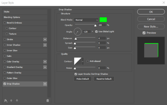
by now, you know how to utilize ctrl+T to move these layers where you'd like them. harry's name is centered horizontally and vertically and rotated at a bit of an angle and the angle brackets are centered horizontally and i just eyeballed where to put them in relation to the space between the border and the edge of the gif.
this is the complete first gif. what i would do for your own sanity since you have two more of these two create is 1) save it as a psd just in case something crashes and 2) don't convert it to a smart object until you have all 3 gifs completed and are ready to put them together.
the nice part about having the first one done is you've ultimately done the hard part. create your two other gifs, but you'll be using at least roughly the same coloring and all the same text, just with the colors adjusted, so you can drag those layers from your completed first gif to your others as you work on them.
once you have all 3 gifs completed and still on 3 separate canvases (and saved as psds bc this is adobe friggin photoshop and shit breaks all the time), convert all layers on all the gifs to smart objects. this will simplify the final gif and make things much easier.
then, bring gif #2 and gif #3 both onto gif #1's canvas. this is what it will look like at first on the timeline and in your layer panel:

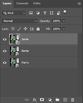
(full disclosure, i'm not making the other two lmao, i'm lazy and i already did it once in a way harder way 😂)
to get the gifs to play after one another rather than simultaneously, you just have to drag them after one another on the timeline!

a little bit hard to show the actual process, but you're just clicking the bertie layer and dragging it down to harry's line after the harry layer. then do the same with the jamie layer, dragging it down to the harry layer after bertie. when you're done, it should look like this:

btw, the little slider i circled is what enlarges or shrinks the timeline view, so if you need to see something broken down a bit more/slower, drag it to the right. if you need to zoom out, drag it to the left.
and that's it! export and save your gif!
if you have any questions or anything is at all unclear about this, please let me know! i'm happy to help!
#answered#Anonymous#gif tutorial#my tutorials#gifmakerresource#completeresources#dailyresources#LISTEN. the way i did this 4 months ago was SO FUCKED#i made it SO SO much harder than it needed to be#you know what that is? growth.
95 notes
·
View notes
Text
Aemond's toast PSD
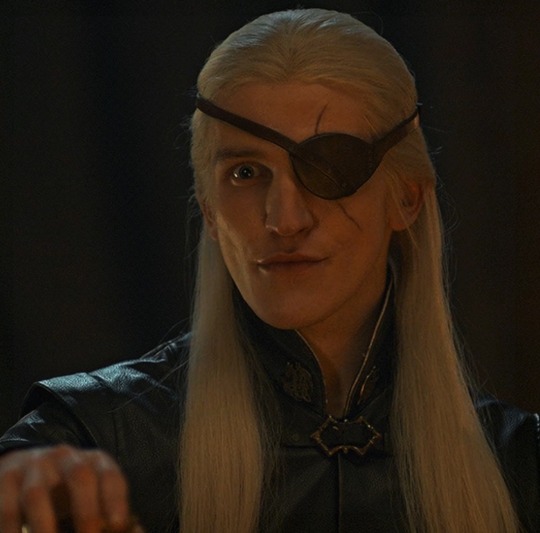
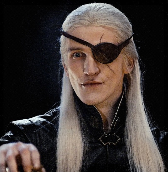
Let's try this again. So, one of my moots asked me how I got this coloring for Aemond, erasing all the background colors but keeping his skin tone, so I thought to share it cause God knows what a nightmare is the dinner scene.
Disclaimer: I’m not an expert at making psds, this was literally a stroke of luck after months of toying with layers
Disclaimer 2: I made this psd before the camera raw filter bliss, may update it in the future.
So, after sharpening and converting to smart object we have this
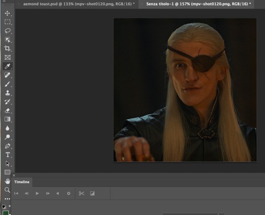
We just need to open the psd and copy every layer into our gif. Et voilà:
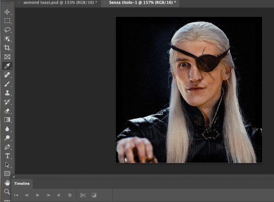
You can play with layers as much as you want of course and you can use this psd with other dark scenes but careful, it always depends on each scene and it better be a scene without too much movement otherwise, if the character moves too much, their face will be half natural half black and white lol.
Also, if you want to change saturation or make the skin stand out more (or less) you just have to delete my edits on the gradient map layer

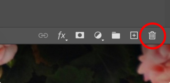
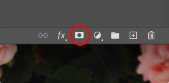
Next create a new mask in the gradient map one

Then pick a soft brush with opacity at 40-45%
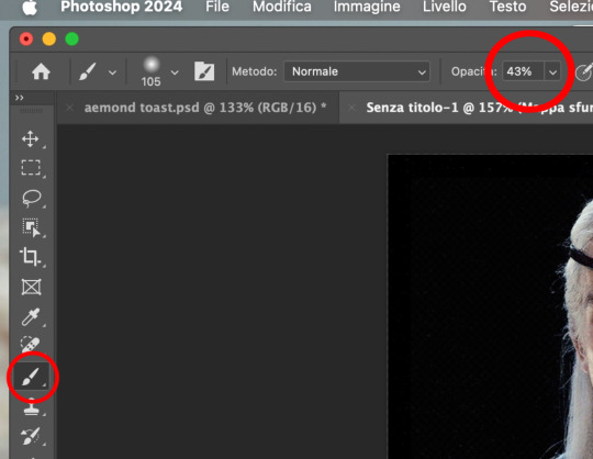
And start “painting” his face to erase the black and white. See?
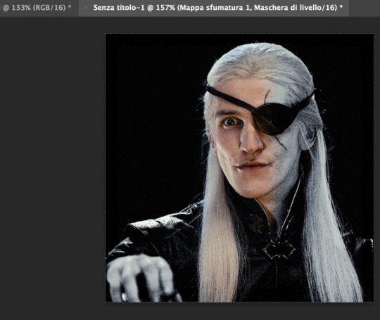
When you’re done -> save for web -> post!
And that’s pretty much it! Happy giffing :)
psd
50 notes
·
View notes
Note
if you have the time/energy to elaborate, what's your process like for coloring stuff you ink traditionally? i've figured out a few different methods over the years, but i generally stick to fully digital or traditional for a piece, so i'm curious to see how you do it! :0
This is such a fun question for me because I get to both ramble about my art process and have an excuse to throw some colors on this Breloom I drew ages ago.
I use Clip Studio Paint and an Ipad for my digital stuff so I'll be referring to the processes on that but I'm sure there is a work around for other programs as well :^)
I scan my traditional art at 400dpi because it's always easier to work bigger with digital stuff and resize it smaller then the other way around :^)

So here's our raw scan, which already looks very decent but when I want to color something I like for everything to be much cleaner/sharper/more contrast-y and to get rid of the noise from the paper texture lmao. A well lit photo will also do the job because that's what I did for many years before getting my scanner but tbh if you're a traditional -> digital artist like myself a scanner is like a best friend you can buy HAHA
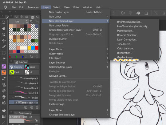
First things first, I apply a Gradient Map Layer > New Correction Layer > Gradient Map
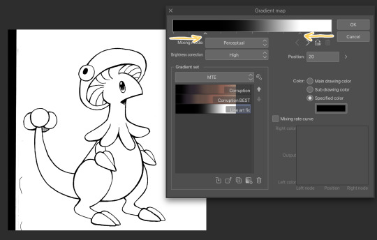
Clip has a really nice black and white map preinstalled but I made myself a custom map just by pushing the black and white a little closer, it completely clears up all the noise and makes everything really crisp! Make sure you check on your lines when adjusting things because super fine feather lines can sometimes be lost if you make the contrast too high. Extra tip! If you want to make Graphite Pencil or Ball Point Pen really nice looking as well, just add a dark grey point in the gradient map closer to the black then middle...works perfectly :^)!!
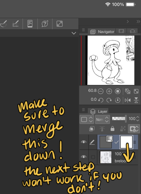
This is the point I look for stray pixels, cat hairs, ect and make sure to erase any surrounding doodles or sketches I don't want included.

GOD DAMN Those lines are CRISP-Y!!!
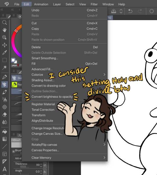
Next up we're going to want to go Edit > Convert brightness to opacity
Tbh If I didn't have this method idk what I would do with myself.... I've tried the whole "Lineart on top layer set to multiply" Method and ...ehh....
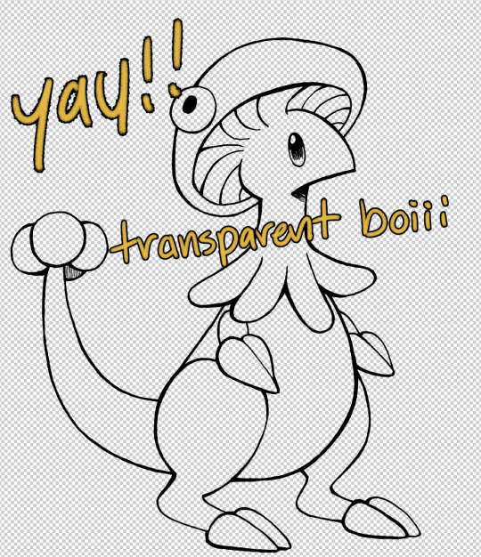
Now that I have a nice transparent line art I'll stick a new white layer down below it because the checker pattern hurts my eyes LOL
I'm going to add a read more here since this post is getting lengthy haha
I'm going to quickly go over the style I use for MTE! It has been refined to be quicker and easier to do since you know...I have a week time limit per page ... 😭 I have a completely different way I do colors for other things I want to spend more time on but I might explain that one in the future...I'm running out of steam tonight LOL

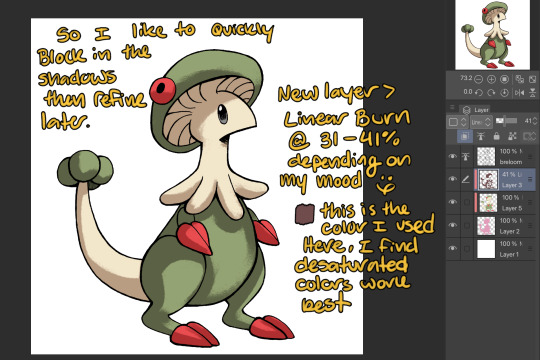
I use this really awesome brush pack that has a pencil like texture and I love it to bits...here's a link to it if your interested!
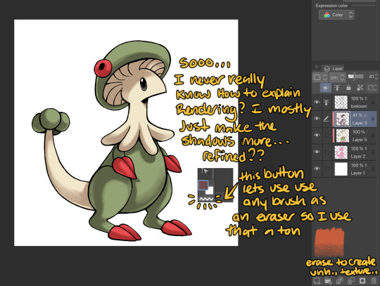
At this point I might add some overlay layers or play around with an airbrush but I think this guys done for now :^) I tend to stay away from highlights with my shading for MTE..My biggest goal is to make sure everything is clear and readable! That being said I break my own rules all the time for special panels that need the extra 'oomf!'

Slap a lazy square background and yay!! He's done!
Hope this was interesting aaaa Thank you again for the ask!!
#art#traditional art#digital art#digital colors#breloom#pokemon#ask#tutorial#art process#coloring tutorial
8 notes
·
View notes
Text
bringing back old editing styles: picspams (no textures needed!)
hi everyone!
so i previously posted this picspam tutorial which was more ~texture~ heavy but if you’re looking to make a picspam that really just focuses on the colors and is simple, then keep reading! :)
example:
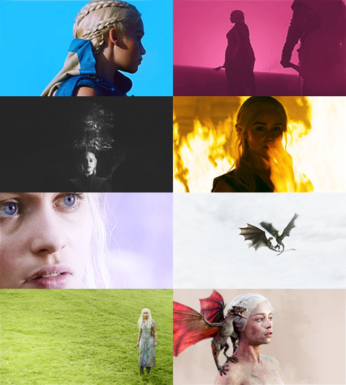
first screencap tutorial: changing the screencap to a color you want that is different from the original lighting
step 1: put a base coloring on your screencap
in this case i added a brightness layer and also a photo filter layer set to the cooling filter so that the screencap has no yellow lighting and more cool lighting

step 2: color the background in using the brush tool
in this case i also changed the color of her eyes) + set it to soft light (you can adjust opacity as needed but i usually leave it at 100%)

step 3: add another layer and use the brush tool to make a light leak + set it to screen
the brush layer should look like this, you can save this if you want and change the hue to whatever color you need!!

the results should look like this:

step 4: adjust the layer with brightness, vibrance, etc to your liking
pro-tip: use gradient map and have it be black to the color of your choice. so for me, i made it black to purple + set it to screen and adjusted the opacity

final product:
now this looks different from the picspam above bc i forgot to save my psd (stupid of me, i know lol) but i hope this helped! also i use topaz labs for sharpening and that's it!

alright next..coloring a picspam that already has the color you want!
step 1: add a base coloring + selective color
add your basics like brightness, vibrance, curves etc. AND selective coloring! for the selective coloring, increase the yellows to +100 and for this, i increased the cyan of the reds but you should just play around with the selective coloring to your liking

step 2: add brush layers
using the bush tool, i used light orange and dark burgundy and set the light orange one to soft light, and the dark one to screen


final product:
just add some more contrast or vibrance if needed and you’re done :D
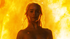
overall, i recommend using the brush tool and setting it to soft light + screen along with using selective color to make the colors really pop out!
hope this helps and as always, my ask box is open to all and any questions <3
best,
~farah
#picspam tutorial#tutorials*#allresources#hisources#emeraldsources#photoshop tutorial#pstutorial#yeahps
184 notes
·
View notes
Note
hi, your art style is so cool!! i love it
as a beginner artist, i was wondering if you had any helpful tips for procreate or anything? the art world is kinda daunting lol😅
thank u so much!! ive been feeling down ab my art so seeing this in my inbox was like a sweet treat LMAOO 🎀
so back to the q…. im afraid i dont have any mind blowing tips. its normal to feel overwhelmed as a beginner, but everyone starts somewhere! i say familiarize urself with basic procreate shortcuts (loads of tutorials online) and always play around with their settings! it should be helpful for the learning process along the way.
for eg ermm i used to abuse the gradient maps settings to pretend i know shit ab colouring 😭💀 i still do tbh, except now i understand how it actually works and i can easily get the colours that i want.
some of the things i learned:
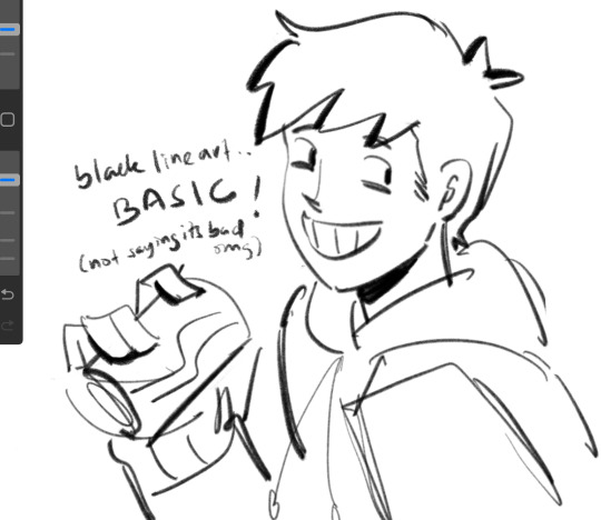
1. cool lineart (i always use this as a part of my render process)
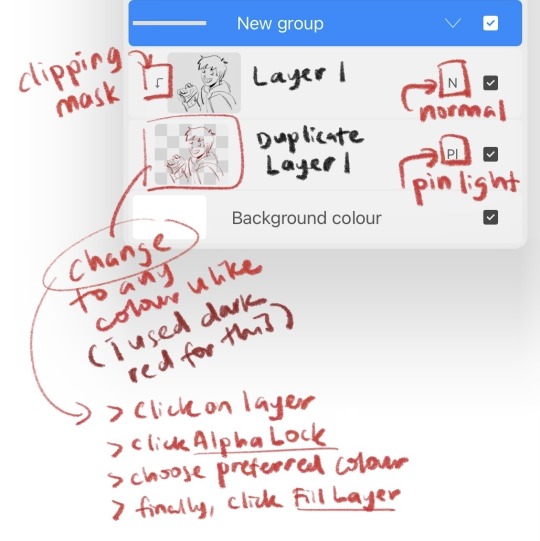
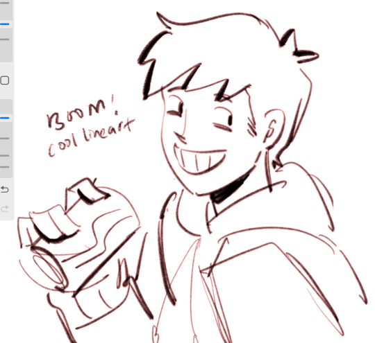
2. art is subjective, pick any that you think suits your preference/is fun to use
for brush, do you prefer it round or textured? lots of pressure sensitivity or none? i like my brushes textured and with a good amount of pressure sensitivity. for blending, do you prefer the transition colour to appear smooth or textured/messy? i sometimes mix between both to give a sense of harmony, but i like it textured more. it all comes down to what feels right to you. pick a few artyles that you like and incorporate it into ur own! pretty basic tip but thats the best way that i know. just pretend ur a mad scientist trying to find cure for like cancer or sumn
3. personal opinion: brush type matters
dont listen when someone says the type of brush u use doesnt matter. yes you can draw with any brush. yes all brushes work the same way 🤯🤯🤯. but theres gotta be that ONE brush that just hits the spot for you, as if its made specially for Your Hands….. unfortunately theres no shortcut to finding Your Brush. it took me 4 years of endless experimenting to find mine.
if ur curious on what brushes i use, i have it listed in my carrd. however i still experiment a lot and dont rly bother to update it, but those should be what i use the most/my top favs !
★ ★ ★ ★ ★ ★
i dont think this covers everything, but this is all i could think of from the top of my head. just lots of trials and errors really, and dont be afraid to make a mess!!! i hope this answers ur question :33 all the best!
9 notes
·
View notes
Text
my drawing process (thank you @pepper-ika!)
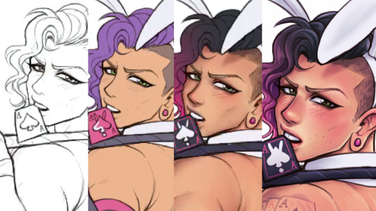
i draw and colour for a long long time. i don't do the traditional sketch + lineart + colour -- sketches are hard to line, they're kind of time-consuming and usually they end up better than the lineart, so i just draw like normal and clean it up before colouring. i start at the head and end at around the feet, kinda like a person showering (lol). here i'm using your typical pencil brush you can find in any standard art program.

a tip i got from another artist was to colour using a thick, opaque pen brush that varies a lot in width. it saves a Lot of time. before they showed me that, i made the mistake of using a soft, painterly brush to colour my art. it hurt my wrist because i had to press really hard to get flat colour -- when all that time i could have just been using a pen brush! also, i start with soft colours because they're nicer to look at.

2. i do colourful midtones like redness in the skin or maybe a blue five o clock shadow if they have one. from this point onward, i use a flat square-ish brush combined with a painterly smudger and a soft airbrush.
i read somewhere that you should apply perfume on the moistest parts of your body so i kind of use that same idea when drawing redness. usually i do it where skin meets skin: folded arms, a crunched back, closed hands, and that place where the thighs touch the buttcheeks, lolol. and of course: the nose, lips, and ears. it makes the skin look real and warm and lively!

3. i lay down my shadows and lights, usually in that order. and at this point, i'm throwing extra shadow on wrinkles, fat, bumps, lumps, etc. a body without rolls is like an angel without wings!
also i smudge like CRAZY here. just like how it's impossible to have "too much gravy" on your chicken, it's impossible to have "too much blending" when you're drawing skin. blend that ish.
when it comes to the colour of the shadows, i always make shadows the base colour but darker and more saturated, and i move the hue a little to the left (for example: orange goes to red, green goes to yellow, purple goes to blue). i do that with, like, every colour. i can't tell if it's lazy or not but at this point i'm too scared to ask.

4. finally i make some minor adjustments like liquifying to fix lopsided eyes or oversized heads/hands. when i was in high school, my art teacher would say "great, but watch the size of the feet, hands, and neck," lolol. he was right ofc. when i go "hm... that looks a little weird," i have to trust that gut feeling because when i do fix it, it ends up looking way better. here is a horrifying gif illustrating that.

AHH!!!
alternatively you could do a messy line and color, then do a whole paintover like i did here. this is awesome for details because you dont have to go back and change the lineart - you just paint over and add whatever you want and redraw the line to fit it.
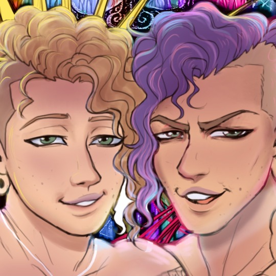
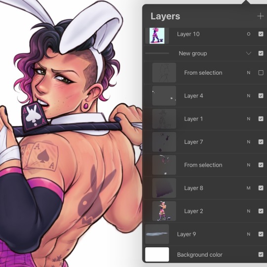
i dont really use the different layer modes that much. in this one i used a gradient map of the drawing as an overlay. idk if that really does anything major but it does create a new range of colors to play with. i also used a multiply layer to cast a big shadow over the card (layer 8) because it has this tiiiny little pattern that would be a pain in the butt to draw shadows over. everything else is pretty standard.
(and no i dont name my layers... yes i will be changing my name and moving countries)
another thing worth noting: i use airbrushing A LOT. i remember reading somewhere that using airbrushes is like. a cardinal sin. it’s not, man. it’s great. airbrushes and smudging are dope and i use them all the time.

i hope you found this helpful! have a great weekend <3
34 notes
·
View notes
Note
hi! i love your gifs they're really beautiful! i was wondering if you have any tips/tutorials about advanced gifmaking. ie. typography, blending, etc. also how to find ideas about things to make. (i'm also finnish btw, it's nice to see other finns here!)
hii jen! i’m so sorry i know you sent this ages ago i’m the worst asdsgdgf. but thank youu!! <3 i can definitely give some tips! i’ll list some under the cut in case it gets long lol.
COMING UP WITH IDEAS: - soo i think i do a lot of sets with quotes and lyrics. tbh i’m not really sure how i usually come up with them, they just hit me i guess. :D and honestly i don't think i'm the kind of gifmaker that comes up with exciting new things lol. but here are things i sometimes do! - i have pinterest boards with nice quotes and lyrics i come across. if i have no inspiration i’ll just go through the boards. tumblr also has some nice poetry! - listen to other people’s playlist for characters/shows/ships on spotify.
TYPOGRAPHY: - i just posted some of my favorite fonts here! - for me the biggest thing is making it easily readable!! so no plain (small) white text on even nearly white backgrounds. - i like adding boxes under my text if i feel like it doesn’t pop enough. if the typography is not super intricate i’ll use different blending modes (usually screen, difference, darken) and gradient/color overlays. - drop shadows also help. i use white drop shadows soo much but colorful ones are super nice too especially if the color of the text is more neutral. - i loove using the difference blending mode with gradient or color overlays (as you can probably tell lol it's like all i do). play with different blending modes on the overlays too. the ones i use the most are color and linear light. - typography doesn’t necessarily have to match in every gif!! i feel like i forget this too often but some variation often makes it more interesting imo.
BLENDING: i recently explained a little bit about my blending process here! i can’t really think of anything to add right now.
COLORING: - levels, selective color and color balance are your best friends! - the first thing i do is add levels and curves. i don’t do anything that special with them, just add contrast and brightness. - if the scene is super dark you could also try adding a brightness/contrast adjustment layer and then setting the blending mode to screen. then just adjust the opacity to your liking. - i usually start coloring by upping the vibrance a little bit, then using color balance to make the highlights cooler (or in case of a blue tinted scene i’ll add warmth). - from there it varies a lot depending on the coloring i want to do. usually i’ll add a black and white gradient map with the blending mode soft light. then i drop the opacity to 10-25% depending on the gif. it makes the blacks deeper and gives a soft contrast that i think looks nice. - if the gif has little movement i’ll add a gradient or a solid color to a new empty layer and use the eraser tool to delete the color from faces and everywhere i don't want it. just make the blending mode overlay or color (others could work too) and you have a nicely colored background! - or you could use the brush tool to paint on the layer too.
i’m sure i forgot hings but if you want me to explain something in more detail just let me know, i’d be happy to help!! AND i’ll try to answer asap. again, i’m so sorry about that. i really hope this helped though :))
14 notes
·
View notes
Text
Inktober 2022: A reflection
This year I did Luna ‘s (who is an amazing artist!! Check them out on Twitter!!) Inktober. Spoiler, I did not do all the days as I got sick halfway through and then just stopped lol. However, it was remarkable good practice and I learned a lot! One might say you can see me improving 👀 It gets better, promise!
Here the full prompt list:

by https://twitter.com/LunaIsAnArtist
1. Sprout
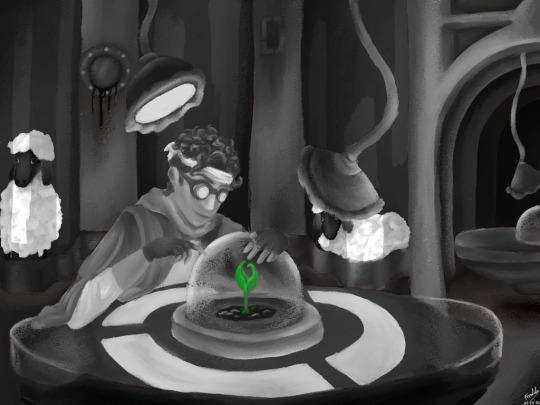
yes this is bdubs fanart, (I’ll do a separate post with the fandom one and tag them there) Also learned about gradient maps!
2. Ladder
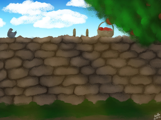
I cannot for the life of me figure out how to render stone, and it really shows
3. Glory
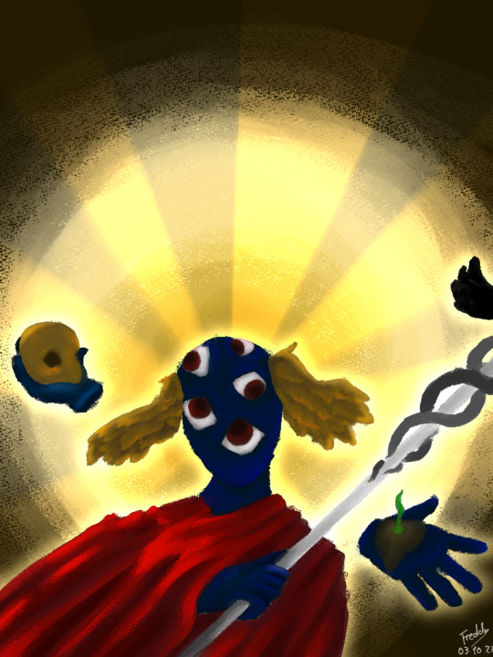

I do not dislike this one, however Clip Studio Paint's weird artistic render line feature really stole the show here lol
4. Investigation

Played with gradient maps again. The color is sure something!
5. Rosemary
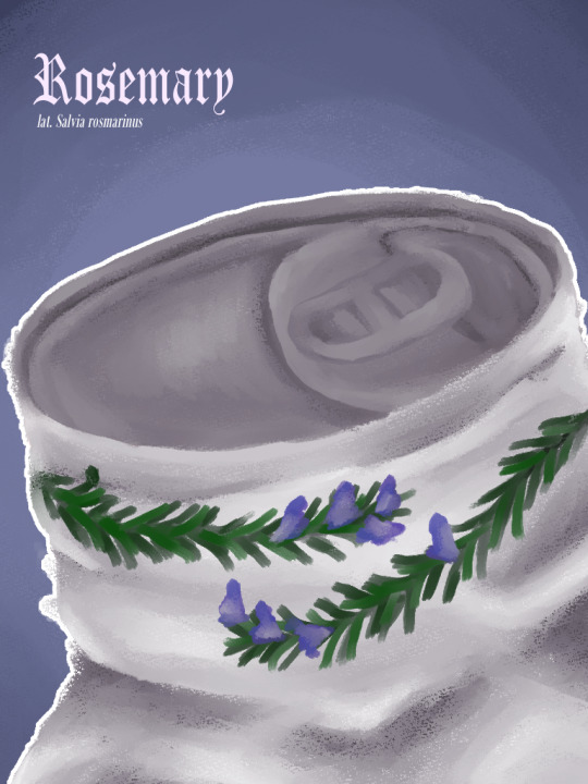
At this point, I was wondering if a completely lineless painting style was something I even like? And honestly it has its appeals, and I think ill keep playing with it, but I missed having lines.
6. Home
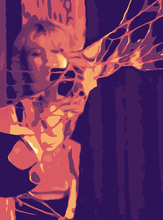
Them <3 @liebesamateur
7. Boots

I love this little buddy!! Look at them!! Lovely!! Also this was when I decided to return to a more painterly lined look for my art again :D
8. Voice

This is one of my absolute favorites!!! The light hello???? also the tiny pumpkin on the hat :D
9. Fragment
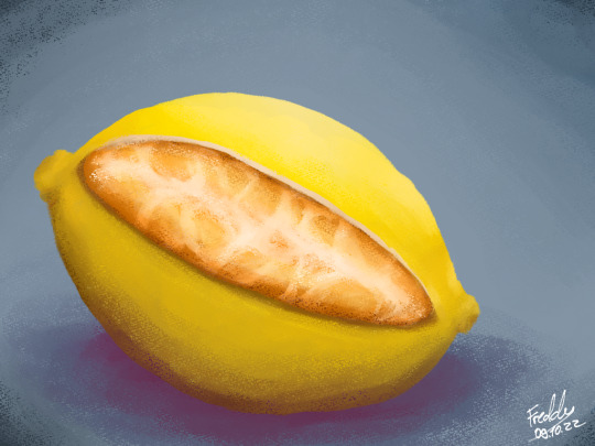
Did a study of a lemon and went you know what would be fucked up
10. Ranunculus

this looks so much better than it has any right to!! Indie game vibes hello?!?
11. Moss

Bdubs fanart again, but look at him, he's just a little guy! Very much based on countless designs I’ve seen all over. (if you know the OG lemme know) Certified creature.
12. Worth

I don't like this one... The concept is there, but the execution is sloppy and kinda off-putting. The only thing I kinda like it the blood at the very top opening.
13. Float

I love this very much not anatomically correct baby!!!
14. Poppies
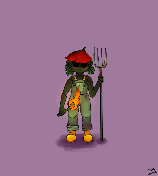
I mean long arms!
15. Zodiac

I’m torn bc on one hand the background is stunning, I love the colors. On the other hand, this would have looked too much better lineless, and the lens sky reflection is just lazy and doesn't fit with the rest of the style.
16. Evolution
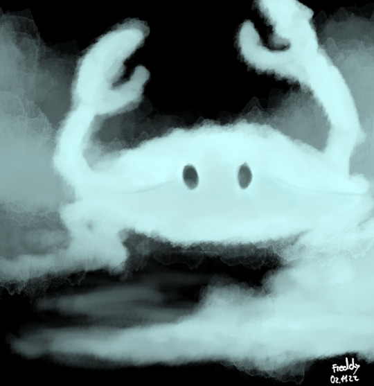
GHOST CRAB!! I downloaded some new brushes, and it was just sooo much fun.
17. Meadow
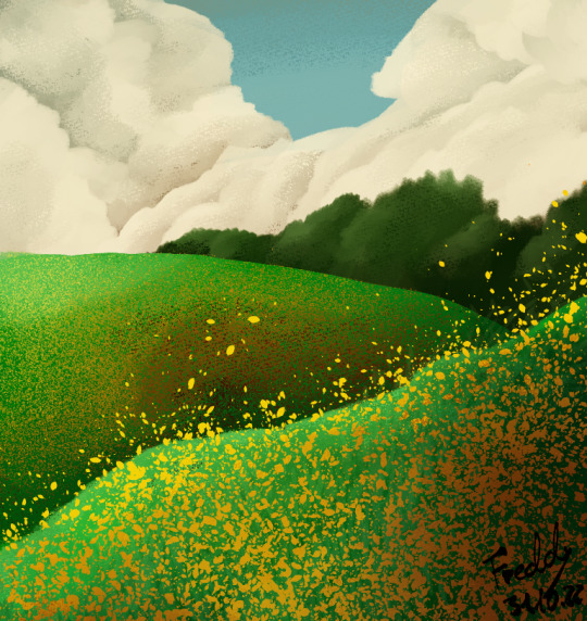
I really like everything except the “flowers”. The clouds and background/foundation is solid, but the weird flower brush is too sharp and it just doesn't work. Also, the colors of the flowers are supposed to be in shade and idk man
18. Examination
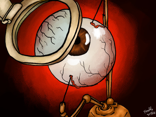
Now this one could make more sense, like perspective wise and the highlights are a bit wack. However, it's really cool and I like it a lot. The bluish tint for the glass, the goldish bronze, the background yes!!
19. Reflection
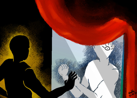
The poses for this kept just not working out. I couldn't get the angles, nothing made sense, so I made them silhouettes! And it works nicely. I like this one. I am kinda starting to overuse that background contrast thingy, but it's fiiiiiinnnne. Also, the curtain??? The red pops so well hello, its just bam, and it deserves to do that.
20. Bullet
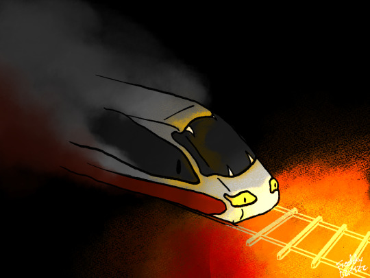
It's a bullet train! Get it? Anyway, I really like the burn effect for this one and I wanted to make it a spooky train. One thing I'd improve is how the likes are fading into the smoke, it doesn't look quite right.
22. Bones

This is kinda my burnout point and it shows. The line thickness is all over the place, I didn't work on this very much and just slapped some things on there and put it up. I'd love to draw a proper pile of bones someday, but this wasn't it.
23. Mutation
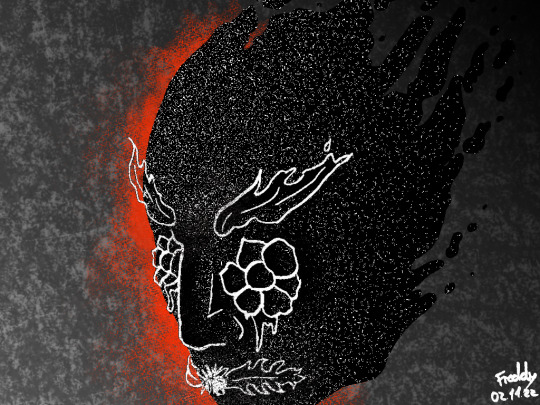
I do kinda like this one, and I don't have any major complaints. I just remember not really feeling doing Art™ at that time.
29. Wyvern
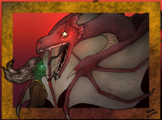
I sketched this the next day and was so normal about it. Idk if this is really a Wyvern, but it looks cool! I really like the frame and breaking it. It gives a nice break and depth!
#Freddy draws#inktober#inktober 2022#lunatober 2022#overall i really had fun#even with the stress of getting very sick and traveling for 2 days straight after recovery#and then walking through a river for 4 hours for class#absolute insane experience I tell you#crossed 3 states in under 24 hours#beware long post#tw blood#tw organs#tw body horror#tw eye horror#tw bones#tw skeleton#my art#original art
2 notes
·
View notes
Text
Gradient Map Tutorial
Quick art tutorial today, hope it turns out helpful! I'm going to do a quick overview of how I use gradient maps because I swear by them as a way to really quickly add good looking color to drawings you don't actually want to color lol
So here we go!
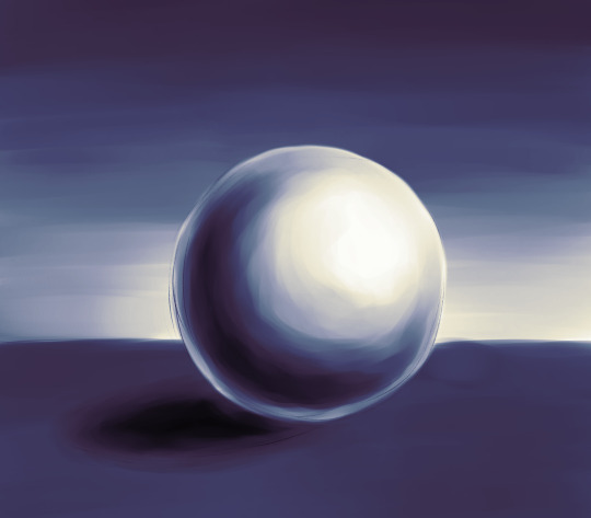
Here's our example ball to help us. I colored it really nicely didn't I? Actually, I didn't color at all, here's what I drew.

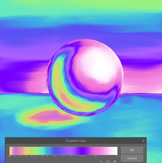
What I did was add a gradient map layer on top of this. This is the gradient and I had the layer at 50% opacity

I'm using Clip Studio Paint, I know Photoshop also has gradient maps, and I'm sure a lot of other programs do too. In CSP, under Layer> New Correction Layer> Gradient Map you'll get this menu.
Essentially, what this does is that it take the range of values in your drawing and assigns these colors to them, the colors on the left are applied to the darkest values, and the colors on the right apply to the lightest. I drew my ball just with black and white, but this works the same way if your drawing has colors. You can use that to get some different effects. And you can go crazy with these gradients.
Here's a couple examples of how I've used these in my art.
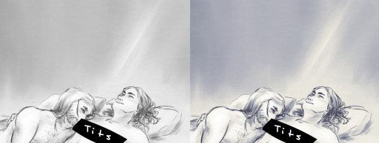
This is using the first gradient I used on the ball at 25% opacity. (You can color pick from any of these gradients)

I used two gradients for this one, to get the characters looking different from the background. Here's how I set it up.

One thing to note is that the gradient maps do affect all the layers below it. So here, the cooler colored gradient on top is affecting the layers where I shaded the characters.
This is a bit hard to explain, but since the gradient maps use the range of values in your drawing, it doesn't work the same way with transparency. Using the ball example, I only drew with black, the darker and lighter shades just come from my brush strokes being more or less opaque. So that layer of shading needs to be on top of the solid white layer I have (though it can be any color) for the shading to then be interpreted as a range of values. Here's what it looks like with the gradient map on, but the white background layer turned off.
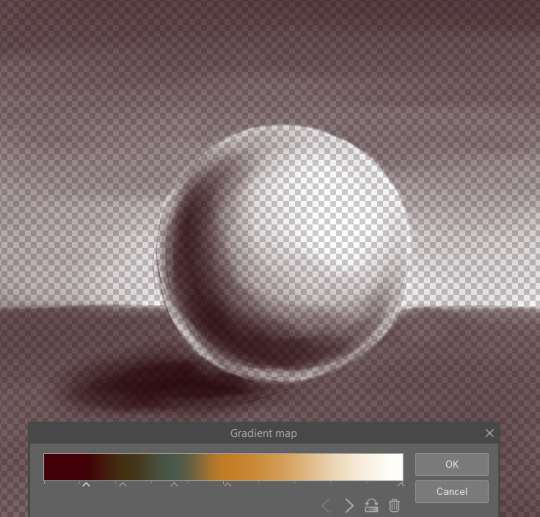
I changed the gradient to show it clearer, but it will apply the color on the left (since I was using black) to my drawing, but it won't use that full range of colors. So, if you want to have a gradient map just on your line art and none of the layers below it, for example, it doesn't really work like that. Though you can switch things up to get an effect like that, such as putting your other layers above both the line art and gradient map layers and then setting them to multiply.
So hopefully that all makes sense! I highly recommend playing with gradient maps and making gradients you like. It's a great way to add some quick colors when you're like me and never ever want to color!!!
#art#art tutorial#gradient maps#tutorial#art ref#reference#idk how to tag this#anyway moral of the lesson is gradient maps are super sexy#theres prob a whole ton more you can do w them that idk about#lazy mans coloring lmao#work smarter not harder#dont look at my poor example ball w the cast shadow in the total wrong place#something something artistic liberties
33 notes
·
View notes
Note
I remember I discovered your art around a year ago, and you already improved SOOO MUCH!!! It’s very impressive! I love your art a lot!
If that’s not a problem, do you maybe have any advices on how to improve art? What were you doing? :0
I hope this is okay :)
Oh gosh thank you so much, I'm so glad people have noticed the improvement ;w;. Honestly, I look back at my old art and sometimes get a bit embarrassed because I know I can do better now but then again I'm only at this point because past me had the confidence to do that art and continue to learn so the least I can do it respect it for the building block that it is ^-^. Plus it's always fun to do re-draws of your old stuff anyway! Like a lil' nostalgia trip~
As far as advice goes...oh gosh I don't really know what to say 😖 My art was stagnate for some time since I went through a rough art block and had such little motivation to do digital arting for a while. It wasn't until I made this art blog and made a goal of wanting to be able to do one of those end of the year art summaries that I started to actually explore the things I could do with digital art and well just art in general. So, I suppose for me, the more regular digital arting really went a long way to improving things, but I do think the thing that improved my art the most was my interest in utilizing the different tools available to me digitally. Learning more and playing with overlays, gradient maps, custom brushes--taking digital art a bit more seriously.
But ngl what really got my butt into gear (and what really brought on a lot of these learning experiences) was my desire to get into zines. Danganronpa zines were just a whole other playing field and boy was I really out of my league at the start! I needed to beef up my portfolio and fast and well...yeah that's basically what I did lol. I drew larger pieces like that earring Nagito, Jason Junko, Christmas komaegi, and holy Rei to help my chances into getting into zines. I started adding more backgrounds to things because they look for that stuff but also to help me get into the habit of do something with the empty space (yknow when I have the energy). And then the zine pieces themselves just further pushed me into improving my stuff even more now that it was going to be among other amazing pieces--I really didn't' want mine to be so...sad looking compared to everyone's else's ;-;.
I guess in the end it was a mixture of wanting to make at least one thing a month (for the art summary), my need for self improvement to make it into zines and feel confident of my work while in the zines, and just my hyperfixation with Daganronpa that gave me an interest to continue drawing so much stuff anyway. After all, a lot of those ideas were things I wanted to do! Making them into larger pictures and giving them a nice background were just added perks so that I can sneakily include them in my zine portfolio application. I don't think I would have bothered to go that far if I wasn't actually enjoying it too ^-^!
Ah I feel like this didn't really answer your question but I suppose the tldr is: find something that gives ya motivation to draw, explore all sorts of techniques, art tools, art styles, background and perspectives--anything that catches your eye and you want to try out--do it! Use references! Get inspired by art you see and try to replicate the effects and techniques they used! Watch youtube speed draws and art program/effect tutorials! And just...have fun with it yknow? The last thing you want is to burn yourself out, so just have fun trying something new and seeing how it works. Don't be afraid of doing a whole 180 from your usual art. You never know what can work for ya if you don't try it out right :3
#anonymous#fala replies#oh god this is so long im so sorry for rambling so much#got lost in the sauce there for a bit#i hope this somewhat remotely helped anon ;-;#and also thank u again for such a nice ask~#it really does mean a lot <3#a e i o queue
5 notes
·
View notes